
Introducing a new banking brand for the Baltics
Following our project for Norwegian bank DNB, we were asked to work on the launch of Luminor. Luminor is the combined operation of Nordic banks Nordea and DNB in the Baltics. The merger created the third largest financial services provider in the region with a client base of around 1.3 million and 3,000 employees. We developed Luminor’s launch website, introducing the brand and welcoming clients to their new bank. Now Luminor is using the website we had created for their forerunner DNB Bank.
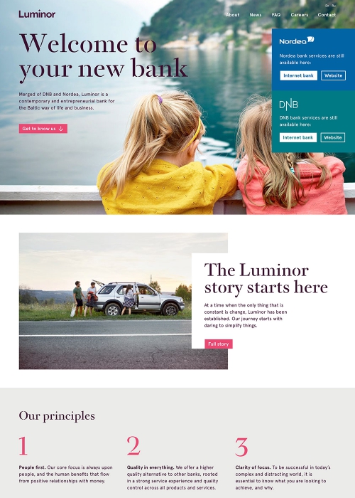

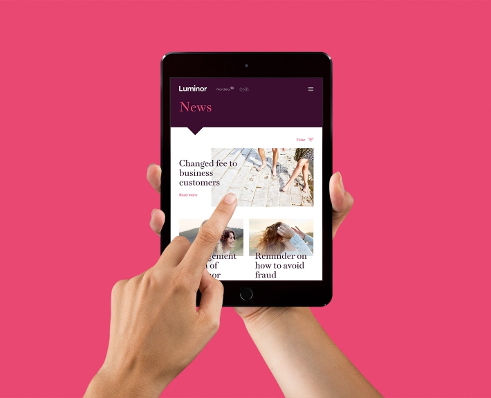
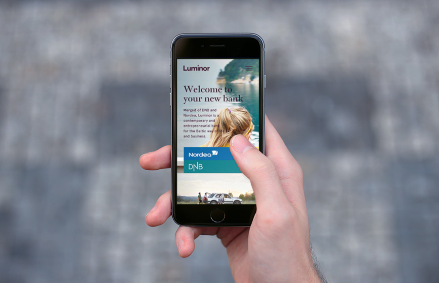
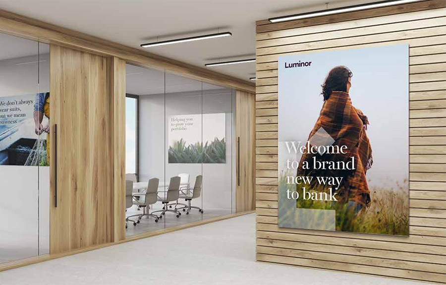
Luminor’s welcome page was developed literally for day one of the brand — its first introduction to existing Nordea and DNB clients across three countries, as well as the launch of a new, forward-looking Baltic bank on the market. We had the honour to be the first to work with the new visual brand identity on the web. Developed by global consultancy FutureBrand, Luminor’s visual identity is progressive, combining solid corporate elements with a bold choice of fonts.
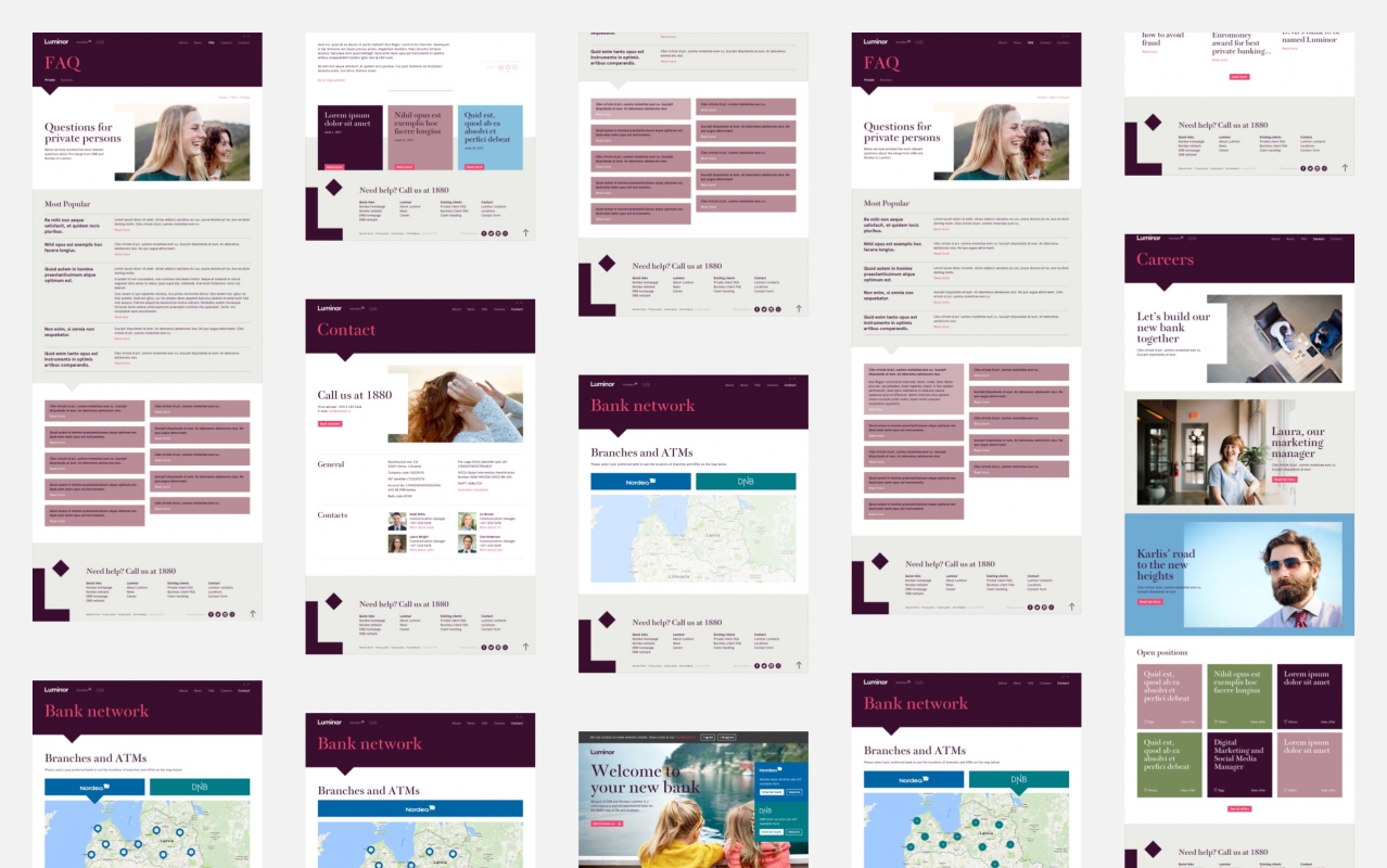
We were consulted by DNB and Nordea for the concept of the site and how to link their well integrated brands with the new joint Luminor brand during this period of transition. We designed and developed both the user interface and user experience for the site, and we created additional digital communication assets, including a template for presentations.
Typefaces used

Over the past few years Graftik have become a reliable partner. Collaboration with them is friendly and professional, they are always going that extra mile, even if deadlines are tough. One more successful project together.